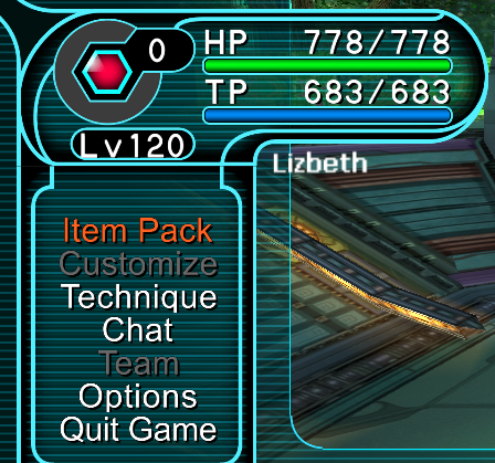
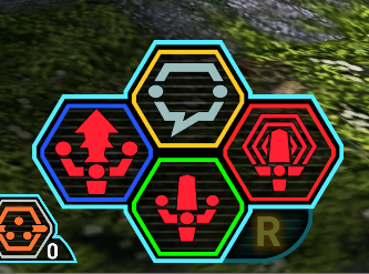
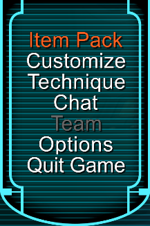
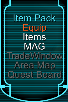
HD UI Project by Luthee (a.k.a Eleria)

Hey, uhm I'm feeling suuuper tired lately (even more than usual) which may or may not be related to the heat. What's more a certain game called Monster Hunter Rise : Sunbreak just released, so the bigger part of my time awake I'm putting in that game at the moment. There likely won't be updates for a while, sorry.

I'd also like to reiterate that if some of you have comments / feedback or improvement ideas I'm open to suggestions.
Still watching this thread, so if you have ideas or find issues please post them and I'll make notes. :)
 
Last edited:
I may have played too much MonHun in a short amount of time, feeling burnt out by it right now.
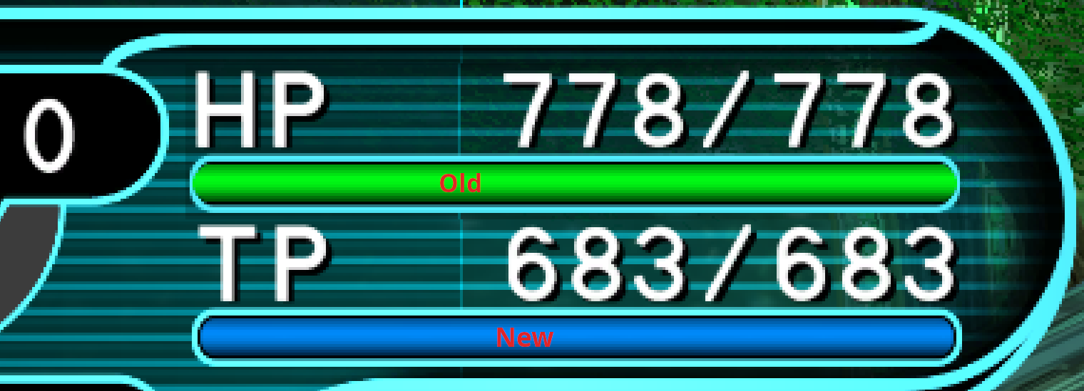
Good news though, I've taken a look at this project's HP/TP bar graphics and made some adjustments in my files through trial and error. I also adjusted the Partner Panel (And 'Extra Display' that is used for mob HP, I think) in order to accomodate for the modified HP/TP bar ends !

Capture59_OldBar_NewBar_Comparison.PNG
 
Last edited:
Hi, i was wondering since i saw in the images the L palette swap button, i'm wondering if you could make the R palette swap button as a replacement for the Ctrl one? i saw that a lot of people use controller, yet not a single hud mod i've seen has made an option for an R button icon instead of Ctrl.
Also, Great job so far on the project, it looks amazing, even ingame.
 
Hi, thank you for checking the project out.
Many people may play with a controller, and in an ideal world I would really want to do alternate graphics, please understand it is a huge can of worms. Some people might play with a PS4 controller, some with a PS5 controller, some with an XBox one, and would want their UI to reflect that. What's more I would need to release an alternate f256_hyouji.prs per configuration, which would mean more files to update, test, and pack for release.
Testing and trial-and-error are laborious processes since the game is online and requires authentication, connection, and 'game' creation before I can see some UI elements. (I can't always rely on an emulated PSOGC for testing as there are many BB-specific stuff).
Capture61.PNG

I'm open to feedback / ideas on this as well... maybe there's a solution to this issue and I'm not seeing it.
 
Last edited:
Seriously ? :confused:
(Was about to upload a slightly updated release)

Capture.PNG
I don't want the friggin tracking cookies !
 
Last edited:
Good news!
I set up a folder on my Google Drive with both the original release (1.0.0) and an updated one (1.1.1). It also contains a spin called "Controller Edition" with R replacing Ctrl as the Palette Swap graphic. Lastly the optional Title Sigil is also present.

Link is in the first post.

@Dude98 You might want to check "Controller Edition" out

Oh and as always I'm open to feedback/suggestions :)
 
Last edited:
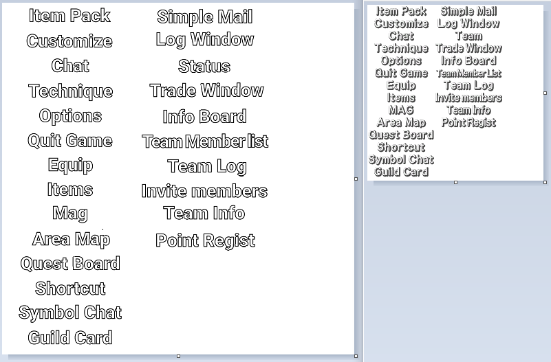
Been using this since the initial release and still loving it. Something I noticed and keep forgetting to mention is that the "Team" option in the menu was replaced by "Status" which is a bit strange.

Also, the Ephinea client will first check for texturejapanese.xvm at "EphineaPSO\data\ephinea\custom\texturejapanese.xvm" and use that one if it exists. So players could leave their launcher set to EN/JP and still use this.

This also applies to title.prs and f256_player_tex.prs. Although I don't know where the player_tex file is used.
 
Oh thanks for mentioning the issue with "Team".

Here's a comparison screenshot to illustrate the problem.
Capture011-psobb-menu-fluffup.PNG

Thinking of re-making this texture with Arial font hopefully in a more faithful way, since I'm slowly moving to Inkscape instead of Illustrator anyway.

I'll also try to update the file structure for next release if possible ! Thanks for the info.
 
Last edited:
There are many constraints that have to be taken into account when adjusting text for the menu texture but I'm putting more effort in the Menu Text this time.

Tentative replacement:
Capture012-psobb-new-menu.PNG

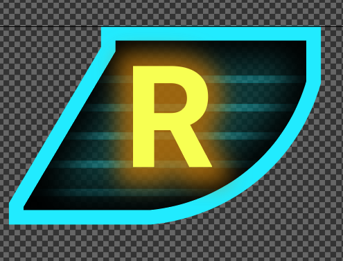
A look at the R palette Swap thing from Controller Edition:
Capture013-psobb-R-palette-swap.PNG

@Ender f256_player_tex.prs is only used for its keyboard buttons in pre-lobby menus as far as I know
Capture014-pre-lobby-keyboard-keys.PNG
 
Last edited:
This is exactly what PSO:BB needed and I wish I saw this earlier, honestly this deserves to be baked it into the client itself when this mod is considered complete. It's like having cataracts removed when you're on a 4k screen.
 
This is exactly what PSO:BB needed and I wish I saw this earlier, honestly this deserves to be baked it into the client itself when this mod is considered complete. It's like having cataracts removed when you're on a 4k screen.
I was literally about to type out the exact same thing. What an amazing addition to this game on a wonderful server. Its so clean and crisp and stays true to the original vibe that us nostalgia fiends crave. Thank you again for this and for making it so user friendly to apply and use! Well done!
 
Thanks for the compliments :)

Just uploaded a new version which introduces new "Start Menu" text graphics and which uses an Ephinea-only folder structure.

Files updated to 1.1.2 :
- HD UI
- HD UI - Controller Edition
- Optional - Title Sigil

Link in first post.

Small followup release which fixes the slightly muted color of Start Menu BG stripes

Files updated to 1.1.2a :
- HD UI
- HD UI - Controller Edition

Link in first post.

Capture019-PSOBB-new-hd-font.PNGCapture018-PSOBB-new-hd-font.PNG
 
Last edited:
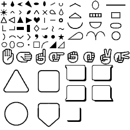
Hey, I've started working on one of the textures related to Symbol Chat, and while it seemed super easy at first glance, making them as close as possible to the originals is not that easy actually.
tex1_256x256_3157621e76ca2f84_b39216d1dbb9cd33_8.png

CapturePSO012.PNG
 
It seems like it changes the names of weapons for some reason. It looks nice but why is my dual daggers called Rail;gun, or a normal saver called berdys? I just put the files in like it said.. something weird it going on here..

weird, when i switch it back from custom to english, it looks fine now with the HD textures still
 
Last edited:
Make sure the texturejapanese.xvm from luthee is in data > custom > ephinea and not in data folder directly, and have the launcher set to ''ENGLISH'' not custom.

You can then delete the one in the data folder (as you may have replaced it with luthees before) it will reload that file via the launcher (and should fix this?).
it was just the issue that I had it set to custom then. I guess I was confused when I read "Installation (v1.0.0 and v1.1.1): Extract right into your PSOBB game folder then set Ephinea's launcher from EN to "Custom" so that no files are overwriten by the launcher/patcher."

because that says switch en to custom. But I guess the newest version doesnt need that change. It's been working fine since I switched it back to english
 
Back
Top