Navigation
Install the app
How to install the app on iOS
Follow along with the video below to see how to install our site as a web app on your home screen.
Note: This feature may not be available in some browsers.
More options
Style variation
You are using an out of date browser. It may not display this or other websites correctly.
You should upgrade or use an alternative browser.
You should upgrade or use an alternative browser.
Echelon's skins & modifications
- Thread starter Echelon
- Start date
Echelon
PSOBB plastic surgeon
- Gender
- Male
Echelon
PSOBB plastic surgeon
- Gender
- Male
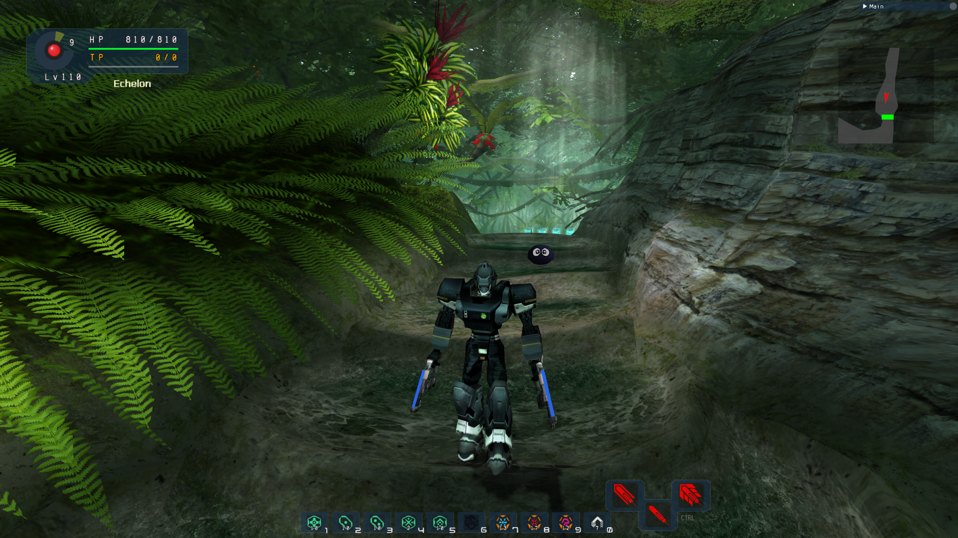
It took me some time to polish it (sometimes this game is hard to skin exactly the way you want), i'm not 100% satisfied but i think i will never be  .
.
So here's the download link: http://www.mediafire.com/file/5c5daeb6vs6l55n/Echelon%27s_Jungle_HD_Remake.rar/file
Hope you guys will enjoy the attention in the little details .
.
So here's the download link: http://www.mediafire.com/file/5c5daeb6vs6l55n/Echelon%27s_Jungle_HD_Remake.rar/file
Hope you guys will enjoy the attention in the little details
K_I_R_E_E_K
Member
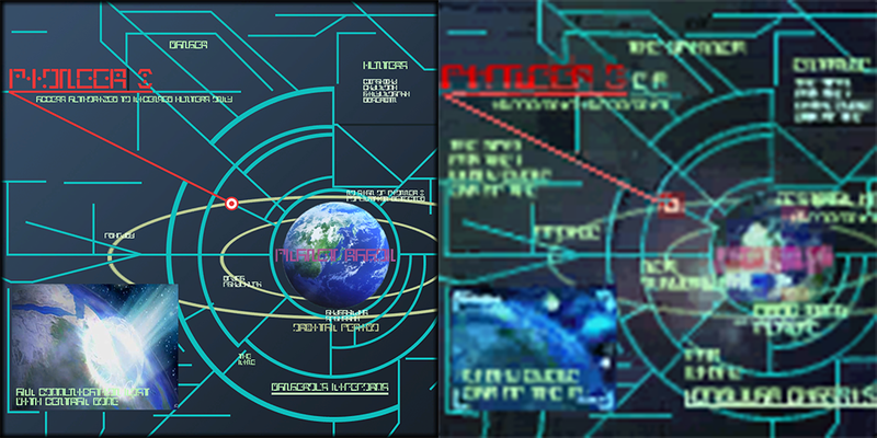
I once had this idea aswell, but never dedicated to much time for it and in the end only some ended up being better than the originals due to the size of the area they are usually placed on.I remastered some Pioneer II screens with High res hand-made textures for my own pleasure.
Not sure if it worth a full upload tho...
Still great work.
Last edited:
MagicLuthee
Member
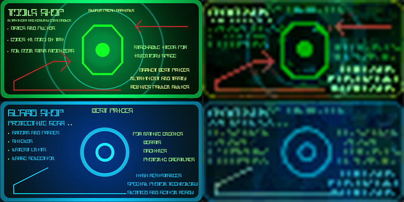
Hello Echelon, what font are you using on your designs ? I found an old PSO font on the internet that seemed alright until I tried using it in a vector graphics file, glyphs were probably traced (vectorized) from a lower-resolution file, which would explain the weird shapes.
Which is why on one of the "holographic" buttons I made a higher resolution of shapes looked way off. (Left is original art, right is my first draft/attempt)

So I decided to "draw" (in quotes because I really don't have any talent) the shapes myself in Adobe Illustrator and it turned out much better. (Left is my second attempt, right is original)

I like your drawings / designs. The shop signs look amazing too.
I'm currently making a UI mod for (Dolphin Emu) PSO GC and posting updates as I go at https://twitter.com/eleriaqueen
(To the question "Why not for BB" which I usually get I answer that Dolphin-Emu can load plain PNG's which I just have to optimise with OptiPNG for faster loading and smaller memory footprint. No quirky format, I also tick the "Force 24 Bit Colors" in Dolphin-Emu so colors are preserved)
Here's an in-game screenshot at a somewhat high resolution :
And here's an attempt at remaking the "Now Saving" icon :
Which is why on one of the "holographic" buttons I made a higher resolution of shapes looked way off. (Left is original art, right is my first draft/attempt)

So I decided to "draw" (in quotes because I really don't have any talent) the shapes myself in Adobe Illustrator and it turned out much better. (Left is my second attempt, right is original)

I like your drawings / designs. The shop signs look amazing too.
I'm currently making a UI mod for (Dolphin Emu) PSO GC and posting updates as I go at https://twitter.com/eleriaqueen
(To the question "Why not for BB" which I usually get I answer that Dolphin-Emu can load plain PNG's which I just have to optimise with OptiPNG for faster loading and smaller memory footprint. No quirky format, I also tick the "Force 24 Bit Colors" in Dolphin-Emu so colors are preserved)
Here's an in-game screenshot at a somewhat high resolution :
And here's an attempt at remaking the "Now Saving" icon :
Last edited:
MagicLuthee
Member
I changed permissions on my gallery, everyone should be able to see it now.
Last edited:
MagicLuthee
Member
With Vector Graphics you are able to export any resolution you may want out of the art without it ever getting pixelated (unless you want it to be so).
There are many caveats though, one of which is that Vector Art is quite awkward to make if you're used to regular digital art.
There are many caveats though, one of which is that Vector Art is quite awkward to make if you're used to regular digital art.
Aleron Ives
Member
One nice thing about working with Dolphin is it handles high resolutions properly. Unlike BB, the in-game text in Dolphin doesn't become microscopic when you increase the resolution.
MagicLuthee
Member
On that subject Aleron Ives, I'd really like to be able to make a font for my mod but PSO seem to use a whole bunch of different versions of it's "characters palette", it's really weird and I think unless I replace them all with a custom file not all text in the UI is changed. Do you know what's up with that ? (Phantasy Star Portable 2 does the same thing)
(At the moment having a low-res scaled text on a "high res." UI is a bit jarring)
A nice bonus is that as I'm only replacing textures at the moment, my mod is compatible with a widescreen mod as well as other niceties...
(At the moment having a low-res scaled text on a "high res." UI is a bit jarring)
A nice bonus is that as I'm only replacing textures at the moment, my mod is compatible with a widescreen mod as well as other niceties...
Last edited:
Aleron Ives
Member
Nobody knows exactly how the font works. Most likely since the game was intended to run at a fixed resolution Sega is using something like an 8x8 tile font, so you'd just have to start looking at the various alphabets you get in texture dumps and try replacing them one by one until you find the texture that's actually being used for the menus and such. Maybe there's a version with 32x32 letters and Sega uses mipmaps to get the smaller text sizes... It's anybody's guess.
Wil
HUmar Scum
- Guildcard
- 42005376
I remastered some Pioneer II screens with high res hand-made textures for my own pleasure.
Not sure if it worth a full upload tho...
New vs Old comparisonView attachment 6904
View attachment 6905
I WANT ITTTTTTT. Holy shit that's fantastic.
Echelon
PSOBB plastic surgeon
- Gender
- Male
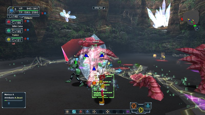
So, I grabbed the technique texture pack and for some reason, a lot of attacks now give off these little squares full of lines.
Hmmm idk this pack is kinda old, did you set your language to custom before installing?
Echelon
PSOBB plastic surgeon
- Gender
- Male
Dragunov 404SVD
"A rifle-type weapon camouflage based on a popular model and enhanced with a special scope.
Rumors say that it was designed for a legendary spy."
(Click for zoom)
For the story, IRL the scope on the Dragunov is called "PSO-1" and it was featured in the metal gear solid games, so i thought it could be a nice nod to both franchises.
Base model is from the Rianov 303SNR.
I needed a skin for my hell laser.
*returns to event farming.*
Last edited:


